3.1.2. UHDAS at-sea Web site figures
The UHDAS web site has a page with figures that update regularly (every 5-30min) when data are being recorded. The following text and figures describe the layout of the UHDAS Figure (live) dashboard and the content of each figure.
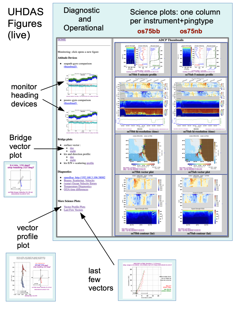
3.1.2.1. Right Side: Science plots
“5-minute profile”
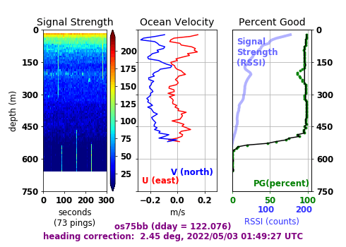
These are updated every 5 minutes with data from the most recent averaging interval (usually 5 minutes) for the relevant sonar.
left panel:
This is a colored timeseries of backscatter from beam 1 of the sonar.
Bright vertical lines or stripes are usually acoustic backscatter from other sonars.
A horizontal orange stripe could be the bottom (if it’s in range).
The horizontal axis is the index of the ping in the 5 minutes of data.
center panel
The two lines are calculated ocean velocity E/W (in red) and N/S (in blue). The scale on the bottom. Typical ocean velocities are .2m/s.
right panel:
The transparent blue line is the averaged backscatter from the left panel, after acoustic interference has been removed, plotted as a profile in the vertical.
The solid black line is the percentage of velocities that were present for the 5-minute average, without any additional QC applied.
Green dots show the percentage of velocities that made it into the average after UHDAS QC’s them. The quantity is called “Percent Good”.
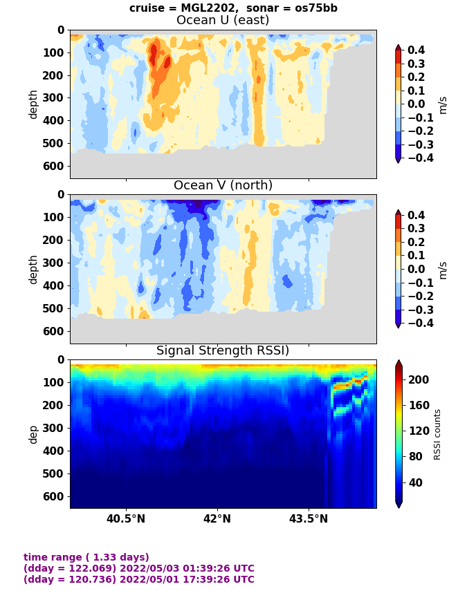
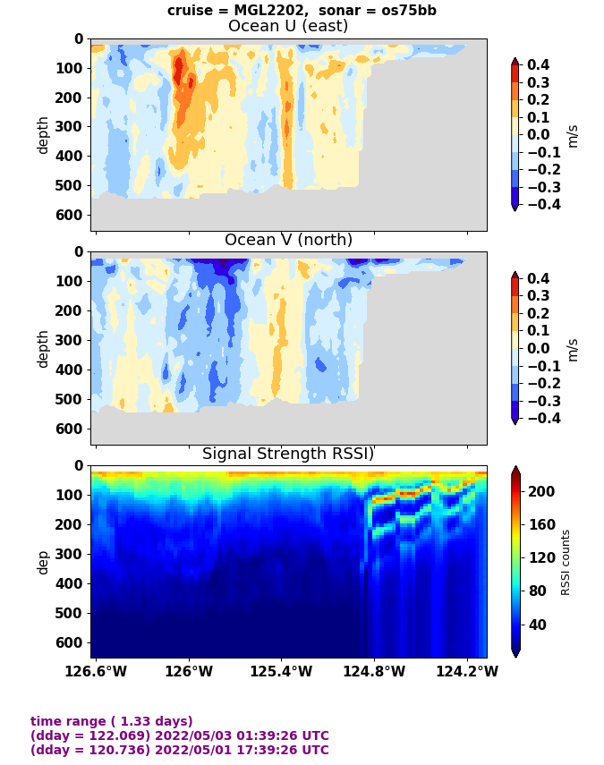
“hi-resolution (time): 1.2 days of 5-min averages
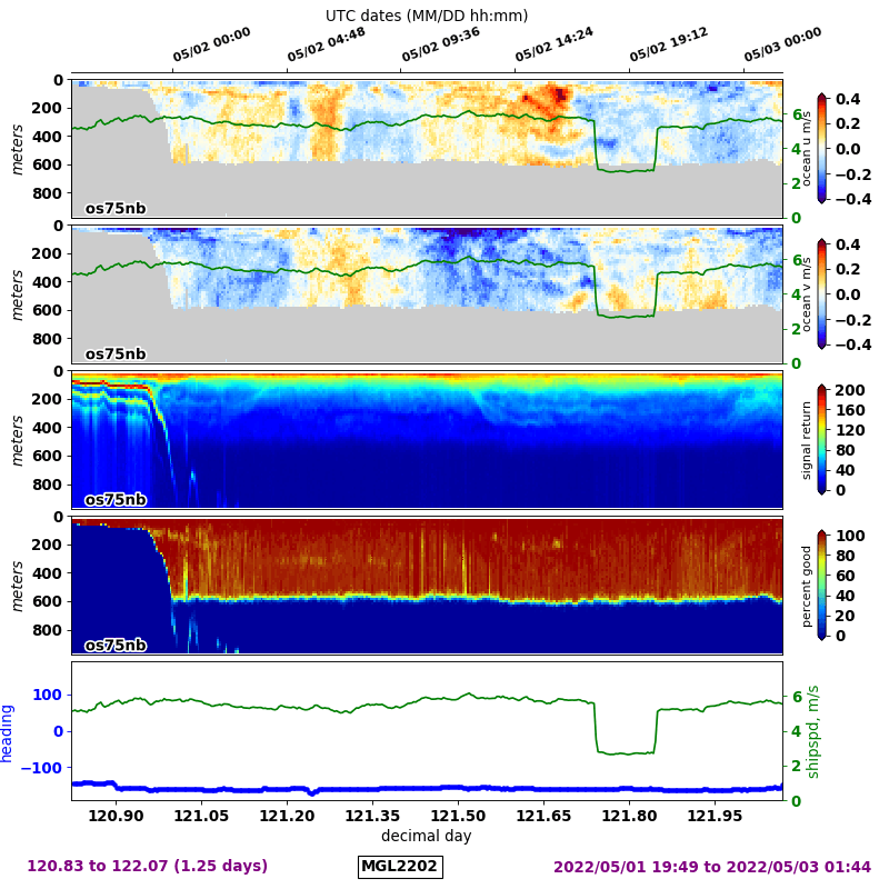
- All:
left axis is depth
bottom axis is “decimal day” (zero-based floating point representation of day of year). The 24-hour UTC time is at the top of the plot.
- top panel:
This is a timeseries of the E/W ocean velocity (the red lines from the 5-min plot). Depth is the vertical axis shown on the left. On the right is the scale for ship’s speed, in m/s (the green line on the plot). In this color plot, reds are positive (eastward flow) and blues are negative (westward flow).
- second panel:
This panel is the same as the top panel, but for N/S ocean velocity, with positive (reds) indicating northward flow, and negative (blues) indicating southward flow.
- middle panel:
This is drawn the same way as the left panel of the 5-min plot (color panel plot), but it shows all the averaged profiles (blue line of 5-min plot, right panel) of backscatter. Things to notice: vertical migration of zooplankton at sunrise (down) and sunset (up); often there is a persistent scattering layer around 400m-500m.
- fourth panel:
This is a color panel plot of the Percent Good (“PG”) from 1.2 days of data from the 5-min averages (green dots in the right panel of the 5-min figure). The color bar has a change at around 80PG so the eye can see when things are starting to get marginal. The usual cutoff for acceptable data is 50PG.
- last panel:
This is a timeseries of ship speed (axis on the right) and heading (axis on the left).
“vector plot”
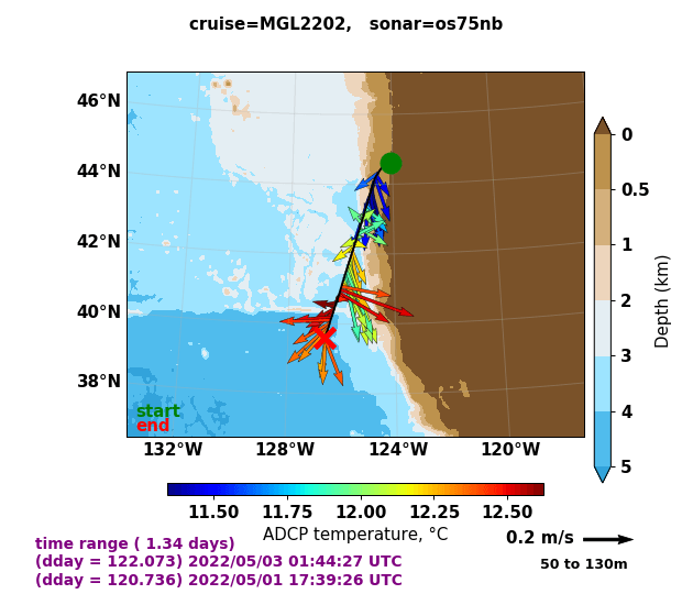
These are 15-min averages of ocean velocity in a shallow layer, during the last 1.2 days. The green dot indicates the start of the cruise track (1.2 days ago) and the red ‘X’ marks the current location.
“contour (lat)”
This plot has 3 panels, more heavily averaged in the horizontal and vertical than the original 5-min values in the database, and span 3 days. The x-axis is latitude, so the plot will only make sense if the ship has a significant N/S cruisetrack during the last 3 days. Time is not indicated here. The panels are:
top = E/W velocity
middle = N/S velocity
bottom = backscatter
“contour (lon)”
This plot has 3 panels, more heavily averaged in the horizontal and vertical than the original 5-min values in the database, and span 3 days. The x-axis is longitude, so the plot will only make sense if the ship has a significant E/W cruisetrack during the last 3 days. Time is not indicated here. The panels are:
top = E/W velocity
middle = N/S velocity
bottom = backscatter
3.1.2.2. Left side: diagnostic plots
3.1.2.2.1. Attitude Devices
“seapath-gyro comparison”

This plot shows the headings of two devices (top panel) and the difference between the headings (bottom panel). The plot shows the previous 4 hours. There is a single red line every 2 hours at the file transition. These plots are designed to glance at and have fairly recent information about whether a heading device has wild deviations (second panel) or whether it is failing entirely (lots of red)
3.1.2.2.2. Bridge Plots
These are designed with the Bridge in mind - ship operations - speeds are in knots
surface vector AKA “Bridge Vector Plot”
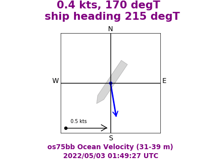
This shows one 5-minute average ocean velocity vector from a shallow reference layer, along with an outline of the ship and its heading
- kts and direction profile
This shows a profile of the speed in knots and the direction the water is flowing. It is probably not very useful. (not shown here)
- kts E/N and scattering profile
This is the same as the 5-minute plot at the top of the science section, but the speeds are in knots. (not shown here)
3.1.2.2.3. Diagnostics
speedlog
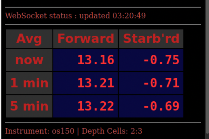
This is a rapidly updating web table with speed of the ship through the water (forward and port) in a standard NMEA message called $VDVBW. The numbers are updated near the ping rate of the instrument, and at 1min and 5min averages.
Beams: Scattering and Velocity
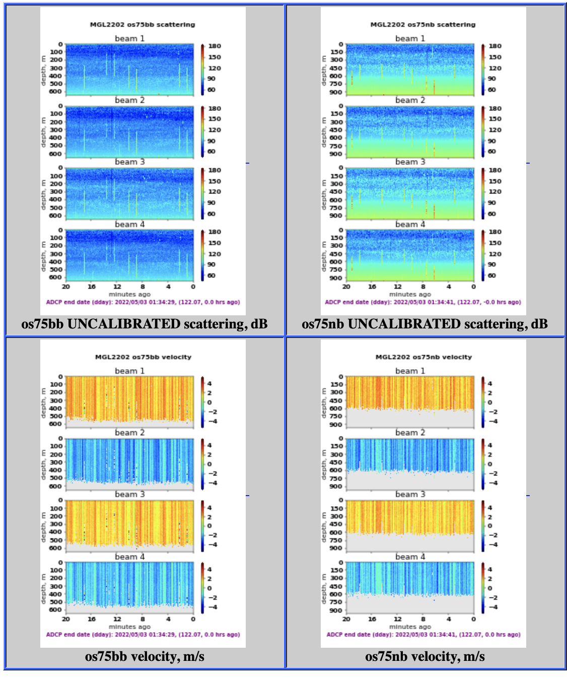
For each instrument and ping type, there are panel plots of single-ping data from each beam: uncalibrated backscatter, and beam velocity.
These plots are designed to quickly peek at the health of the individual beams.
(some) ocean velocity errors

This is a diagnostic plot attempting to quantify ADCP errors. The most useful item on here is the number of pings per ensemble (green dots, top panel).
Temperature Diagnostics
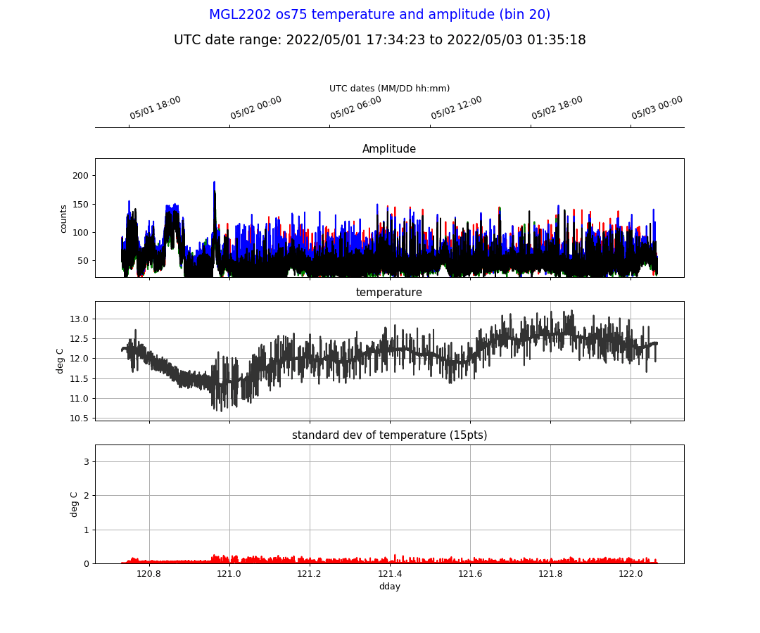
This plot is meant to help diagnose possible errors or failures in the ADCP by looking at a timeseries of temperature and backscatter.
- Of interest:
- Is one beam’s backscatter much higher or lower value then the rest?
(could indicate a failing beam)
Does noisy temperature correspond with high backscatter?
- The panels show:
- top panel: bin 20 backscatter. Noisy values are likely coming from
acoustic interference from other sonars. All 4 beams are shown, with colors 1=red, 2=green, 3=blue, 4=black.
- middle panel: temperature. Sometimes noisy temperatures indicate
the presence of electrical noise (shows up as unusual values deep in the water column - beyond the normal range of the instrument)
- bottom panel: running standard deviation of temperature. This is meant
to help focus the eye on noisy versus quiet periods.
GGA time differences

These plots have 3 zoom levels, ‘zoom’ (few seconds), ‘fixed’ (20sec), and ‘auto (scales to the largest gap). Each column is a different instrument. These plots help illustrate how well-behaved (or poorly-behaved) the GPS sources are. We can learn about missing messages, drifting timestamps, and jittery positions.
Every instrument with a GPS fix is plotted here.
There are two times: the printed time of the GGA message and the computer timestamp upon arrival of the message (“UHDAS system”).
- each plot has 3 timeseries panels of time differences in seconds
top panel: GGA-UHDAS difference (how far off is the computer clock?)
second panel: UHDAS system time (difference between successive times)
third panel: GGA time (difference between successive times)
last panel: ship speed E/W and N/S calculated from GGA lon,lat, time
3.1.2.2.4. More Science Plots
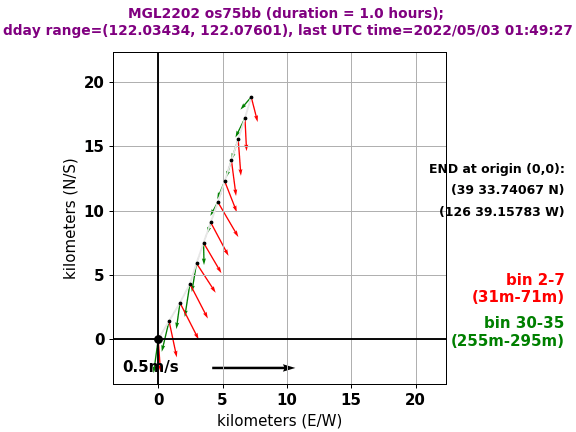
Vector Profile Plots

Each instrument and ping type has a plot
- Panels:
The figure on the right is the same as the “Bridge Vector Plot”
The figure on the left is a vertical collection of “Bridge Vector Plot” arrows, but offset to show the relevant depth (the base of the arrow).
the actual arrow from the original Bridge Vector Plot is in red
- all the other arrows are interpreted the same:
flow represents the depth where the vector starts
an arrow pointing right or left indicates East or West flow
an arrow pointing up or down indicates North or South flow
Flows are shown in a gradient from red (shallow) to blue (deep) just to visualize the individual arrows. The colors don’t mean anything.
Last few vectors
Each instrument and ping type has a plot
Flow vectors representative of two layers (shallower=red and deeper=green) are shown for the last hour of data. The origin (black crosshair) indicates where the ship is NOW. The tail is the cruisetrack leading to that location (where the ship was travelling for the last hour).
This plot is meant to help visualize eddies and fronts.