2.6.4. Ping Mode
Ping Mode is just View Mode with extra figures
Note
Ping Mode only works with a recently-processed cruise on the computer where you are working.
Everything in View mode is also in the other modes.
panel window:
control over number of panels and panel content (click Refresh Panels or Show to update)
sensible pan/zoom or zoom-to-rectangle navigation (axes are connected and zoom together)
topography window:
reference layer bins
averaging time
vector length
control window
overlays of ship speed or heading
multi- cursor (see below)
UTC dates
show in bins or depth
a multicursor which connects
the time axis in the panels
the position in the topography (comes from the time where the cursor is, in the panels)
The navigation tools (Home, Pan/Zoom, Zoom-to-rectangle, and Save) are a subset of Matplotlib’s toolbar.
The new component is a collection of figures depicting a single-ping variables, as described below.
2.6.4.1. Overview of the Windows
Ping mode has a light pink background.
Control Window:
- The Dataviewer View Mode has 3 tabs.
Plot: (control what is viewed)
Log: show time ranges requested so far
Help: a little help (under construction). Most help is in the web pages you are reading right now
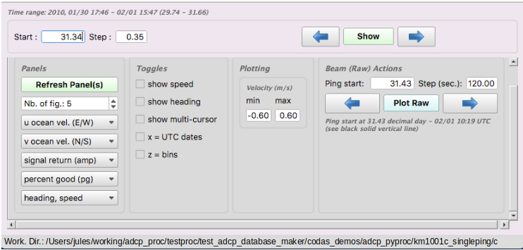
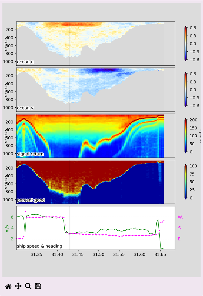
Panel Window:
The panel Window plots averaged data (or timeseries from the CODAS database) in color panels. The only thing you can do in the panel window is pan or zoom, but if multi-cursor is enabled in the Control window, the red line in the panel plot matches the corresponding position in the topography window.
Click here for an annotated snapshot.
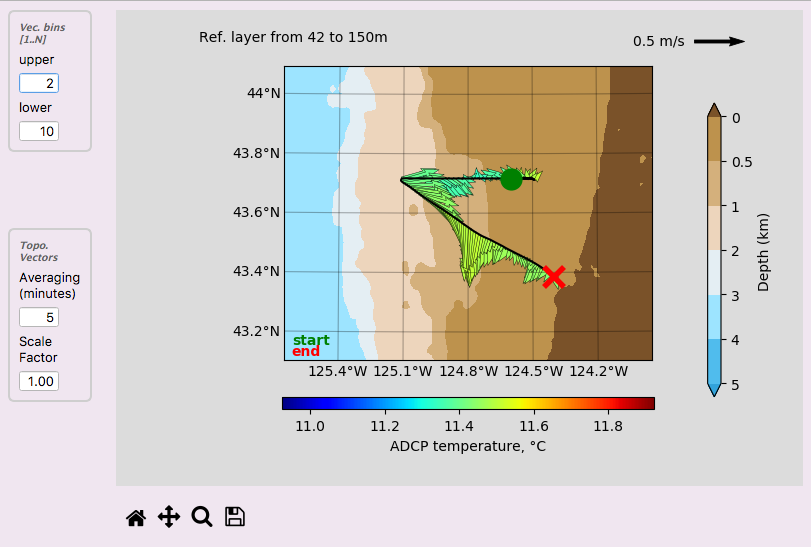
Topography Window:
The topography window is designed to view averaged ocean velocity vectors over ocean topgraphy. You can change some of the display settings (vector averaging in vertical and time, and length of vectors). You can pan and zoom (but the topography does not increase in resolution). If Multicursor is enabled in the Control window, the red line in the panel plot matches the corresponding position in the topography window.
Click here for an annotated example.
2.6.4.2. Overview of the Single-ping Windows
These windows show single-ping information for a time ranges specified in the Control Window.
The point of these plots is to give an overview of the single-ping data to allow for evaluations of - data sparsity - bubbles blocking or biasing the data - ringing or other bias - bottom identification
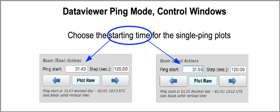
navigation
When you move to the next time range, in ping mode, a vertical black line is drawn at 20% through the time range, and a set of single-ping plots is drawn using a small time range (120sec) starting at the vertical black line.
You can change the start time of that single-ping selection, and you can change the duration. Then click Plot Raw or the right-arrow (or left-arrow) in that Raw control box.
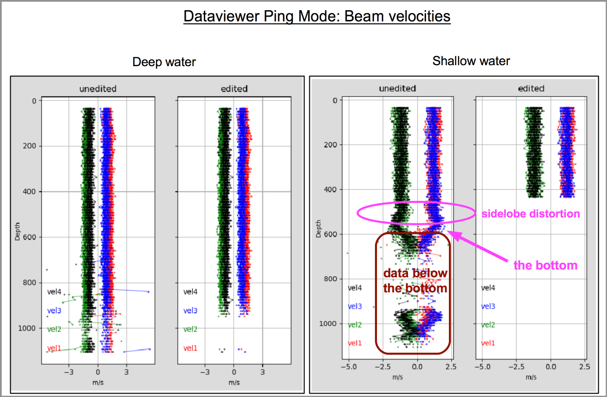
The beam velocity plots show:
beam1 = red
beam2 = green
beam3 = blue
beam4 = black
The left panel has all measured velocities.
The right panel shows the beam velocities after editing at the single-ping level.
Things to look for:
ringing (velocities bend towards zero at the surface)
deep anomalies (usually electrical interference or acoustic interference)
evidence of editing due to bottom reflection
The example below shows what the original data look like in deep water versus shallow water (i.e. the bottom is in range):
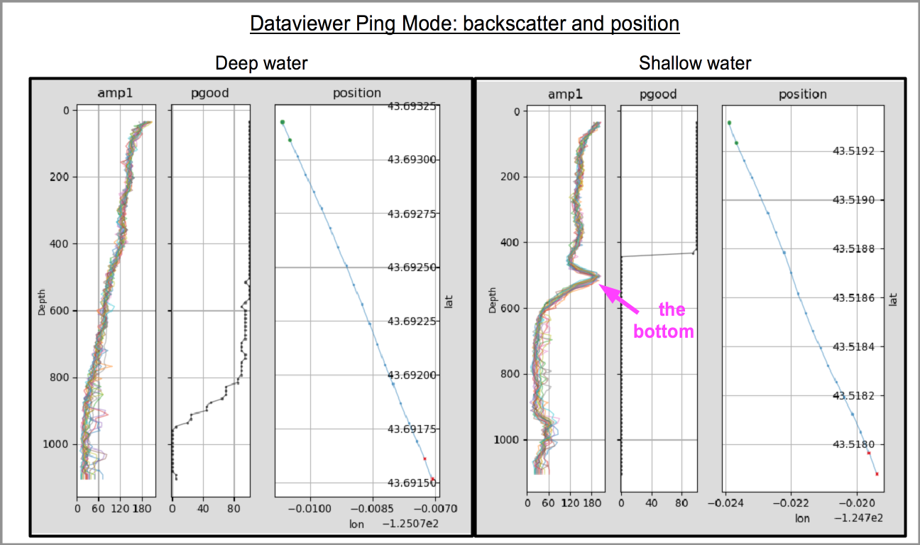
The backscatter plot shows:
backscatter (left panel)
percent good (center panel)
cruise track (right panel)
In this example we can see the bump in the signal return due to the bottom reflection.
Also look at the cruise track:
green is “GO” (the ship starts here)
red is “STOP” (the ship ends here)
So the ship went east and south.
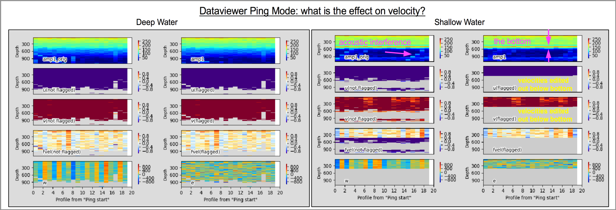
The velocity panel has pcolor plots of
amplitude (top row)
measured velocity east/west (second row)
measured velocity north/south (third row)
OCEAN velocity oriented in the direction of the ship (fourth row)
vertical velocity and error velocity are in the last row
Note that the velocities are measured velocities not ocean velocities. In the navigation plot, the ship was going east and south, so the measured velocities are west and north (opposite to the ship’s motion)
In each of the two screenshots below, the left panels are ‘original’, right panels are ‘after single-ping editing’
That means you can expect to see
in amplitude:
acoustic interference in amplitude (before editing)
bottom return
velocity data edited out below the bottom (shallow screenshot, on the right)
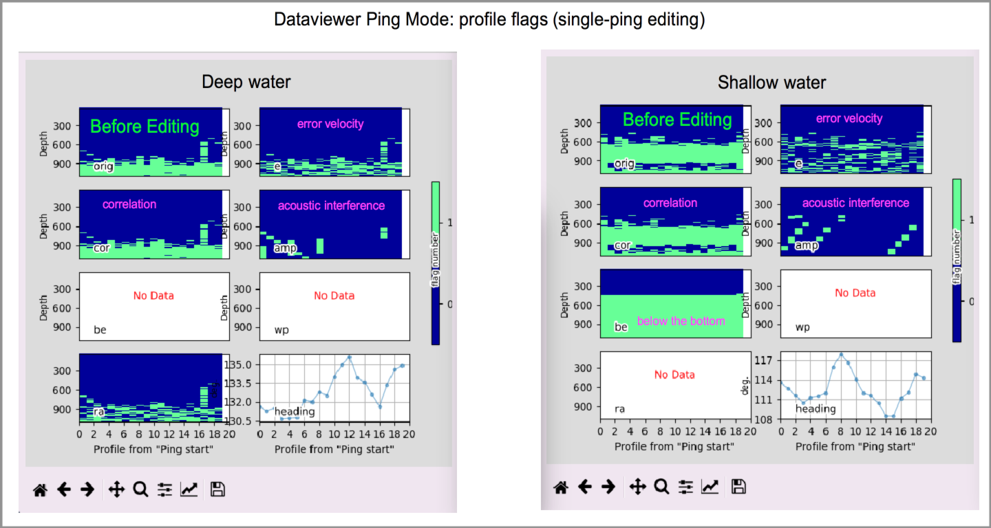
The Profile Flags panels show some of the single-ping editing.
(Return to TOP)